Passive communication is a subtle thing
Information, placed in a public location, does not automatically find it’s way into the human mind and begin to effect behavior. As a seasoned sign maker, advertising professional and behavioral scientists, I have seen my share of well designed signs – and also plenty of grating eye sores. A well designed sign has the effect of drawing a person in to read more of its content – and hopefully commit some of the information to memory. A poorly designed sign can contain exactly the same information – yet repel the intended audience to the point that they do not even notice its presence. Some people may even become contemptible toward its message .
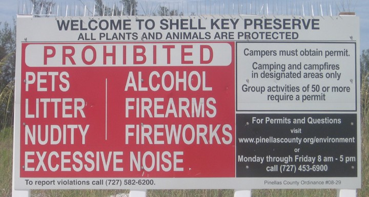
Take, for example, the Welcome to Shell Key Preserve sign shown below. Have you ever seen anything less welcoming than this sign? Due to poor design, these signs give the impression that people are merely tolerated on Shell Key. They are universally disliked by visitors to the island. Not everyone knows why they find these signs repellent. But as a sign designer, I can see the subtle reasons clearly …

The large block of ‘process’ red is immediately painful to the eye. Notice, also, how the words on the sign are all butted against the edges – leaving no margins at all. Designers know that a little empty space around the margins helps make content much more clear to the eye. By trying to squeeze an extra inch of height out of the letters, the designers have made the sign LESS readable – and also visually offensive. The ‘welcome‘ message at the top is completely lost by the PROHIBITED headline. And, after the poor execution of the main content, few people are likely to read the two obscure blocks of text on the right. Setting aside, for a moment, the content of this sign – everything about the design and layout is counterproductive to communicating with passers by.
I don’t mean to harp on our overworked and under-appreciated County Parks & Conservation Resources department staff. They accomplish a great deal with very limited resources. And, it’s not easy maintaining signage on a shifting barrier Island. Yet, it does need to cost more money to make a beautiful and useful sign. Every criticism I have made so far could be remedied with a slightly more competent design and a change in sign-attitude. A more effective sign could be made with all the same materials as the current signs – while being much more useful and attractive. Indeed, attracting people to read it is every sign’s prime directive. And this communication is absolutely critical for sustainable public use of this resource. For the benefit of Shell Key, its wildlife and ecosystem and the people who visit here, we think it’s time to seriously rethink the way signs are used on Shell Key.
We would start our suggestions with a simple premise: That people actually ARE welcome on Shell Key – and that we are asking for their help in watching over this island…
The punishment myth
A sign can’t issue you a citation. It can’t enforce the law. And there will always be some people who ignore it. That’s why a good rules sign is really designed to keep honest people honest . It should draw them in and ask for their cooperation. Too often, rules signs are conceived from a punitive perspective. They are designed to issue a threat of punishment for violators. But, it’s a mistake to try to intimidate those who don’t care – while simultaneously alienating those who might care.
Behavioral science shows us that punishment or the threat of punishment is the worst possible way to build long term behaviors. Behaviors or ‘habits’ formed by punishment are the most volatile and quick to disappear. That’s why people who use punishment as a method for reinforcement always end up using the timeless phrase “I-DON’T-WANT-TO-HAVE-TO-TELL-YOU-AGAIN!“. Yet, they have selected a method of reinforcement that virtually guarantees that they will have to continue punishing indefinitely.
I’m not saying punishment is wrong because it’s mean. On the contrary. If punishment actually worked, I would reluctantly support this approach. But, as a behavioral scientist (and also a parent and pet owner), I have seen overwhelming evidence that punishment is a terrible, inefficient and ultimately futile way to influence long term behavior – both on an individual and on a social level. Most people believe in punishment because they see no alternative. It is deeply ingrained in our culture and laws. “Spare the rod, spoil the child”. But behavioral science shows us that the choice between punishing – and “doing nothing” – is a false one. We can cultivate behaviors and attitudes the same way nature does it…
Habits that are naturally the strongest and hardest to stop are those that are driven by internal desire. Internally driven habits are automatically reinforced at all times – and they result in deeply rooted behavior – for better or worse (depending on the habit). This gives us a clue how to use this tendency to our advantage when designing a rules sign. Instead of getting caught in that familiar pattern of intermittent punishment – followed by brief compliance – followed by rapid decay of the compliance, we can use human nature to our advantage by spending our efforts making people actually want to cooperate with the rules. This takes a little more creativity – but is well worth effort because behaviors built this way are much stronger and long lasting.
 People love to be asked – about as much as they hate to be told things.
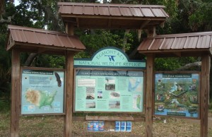
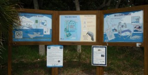
  And, it turns out that people respond surprisingly well when they are asked politely to help. That’s why the signs on Shell Key should be designed to enhance the visitors experience with information and a sense of inclusiveness. They should draw people in with an attractive overall design – and they should gently inform them about the rules and why we are asking for their cooperation. And, they should impart knowledge and teach skills that will give people a sense of inclusion. Check out these examples of some great signage at the Ft. Desoto boat docks. It would not be viable to put this particular type of printed sign on Shell Key, but the positive design approach could be replicated on a more durable sign for the island…
We are currently working on a set of ideas to present to the County for improving the effectiveness of the rules signs – and proposals for more subtle informational signs in some of the delicate areas on Shell Key. We are prepared to offer our resources and volunteers to help design, manufacture and maintain signs for this Signage Improvement Project.
If you are interested in this project, please stay tuned to this site – We will be posting updates and design ideas for this project.


Recent Comments